50 shades of pearl
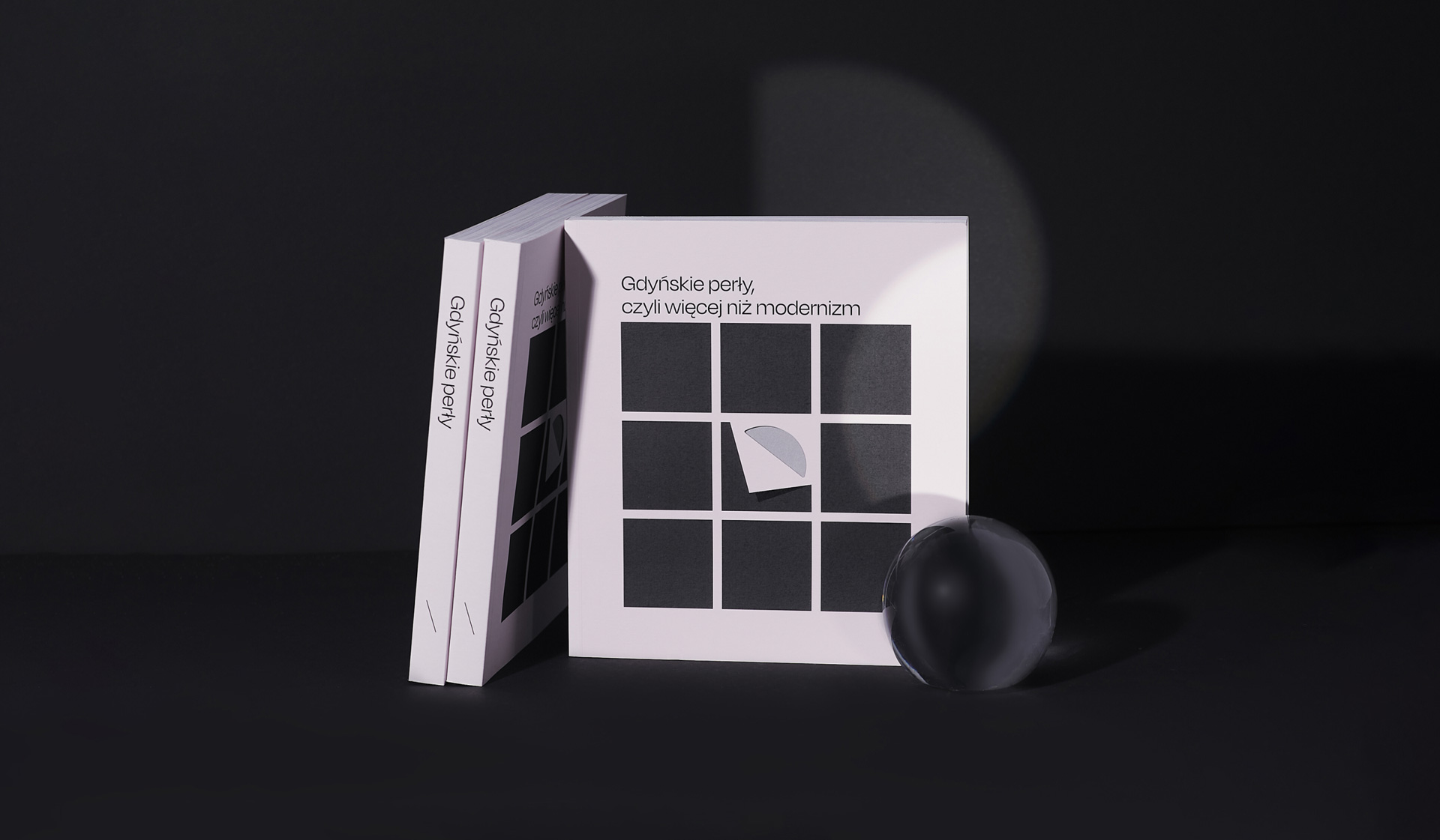
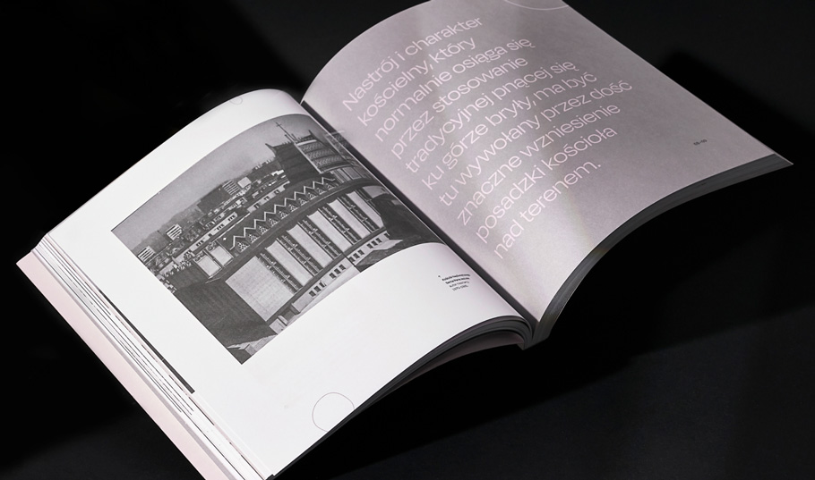
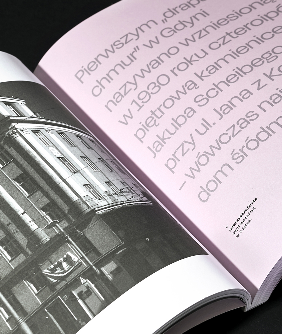
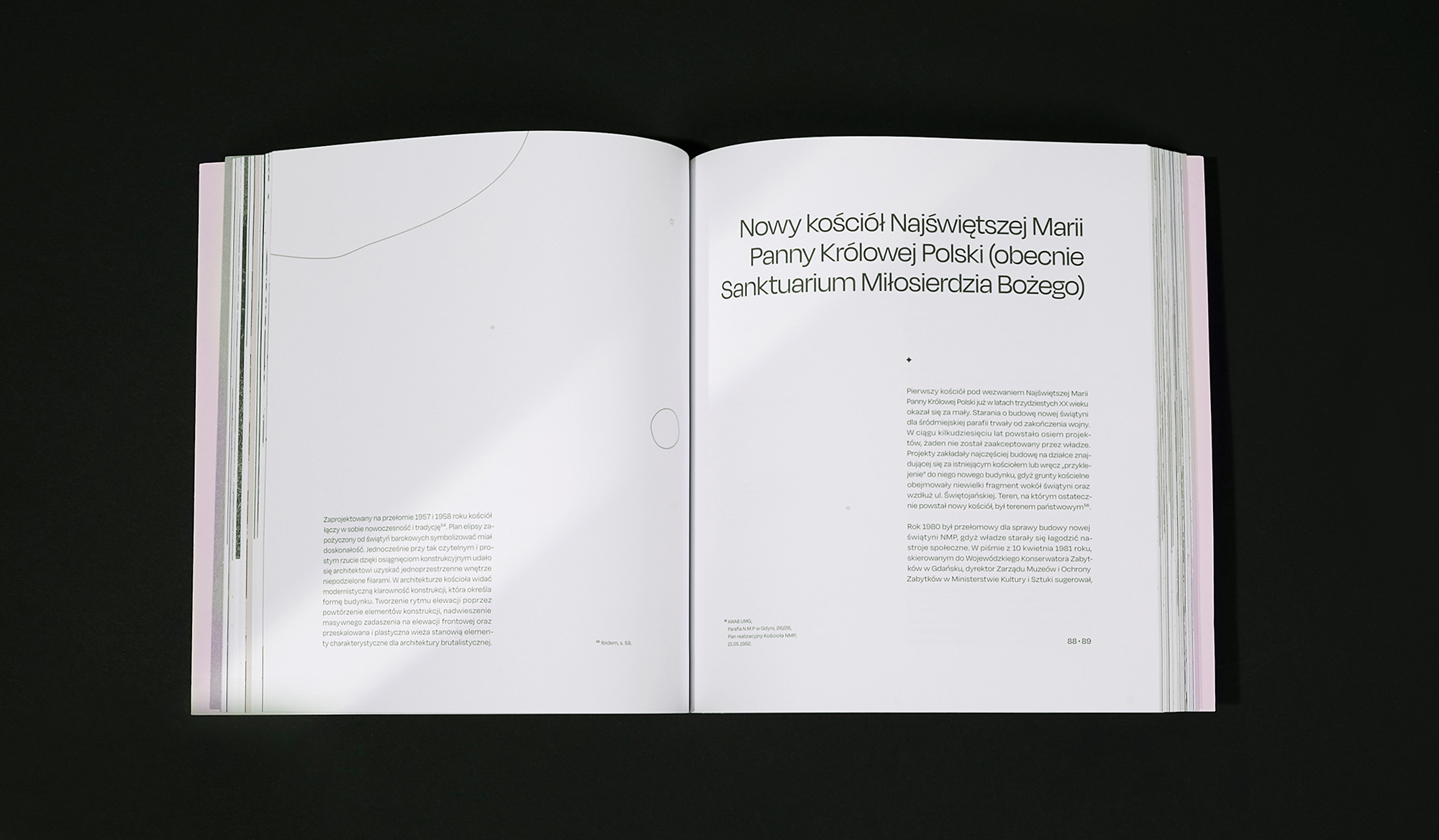
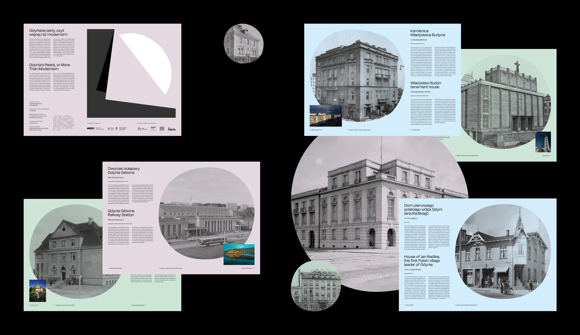
We explored our pearl inspiration even further in the process of creating the publication. The album that accompanies the exhibition is, of course, first and foremost a collection of vast knowledge in the form of texts and photos. No less, we wanted our project to emphasize its content value even more strongly through subtle touches.
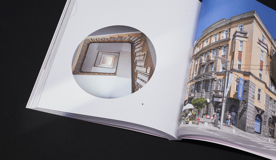
The icons and illustrations are a continuing reference to the irregular form of the pearls. The very use of embellishments is a departure from the modernist, minimalist form. Surprising layouts draw attention to details of architectural solutions that may not be clearly visible at first glance.
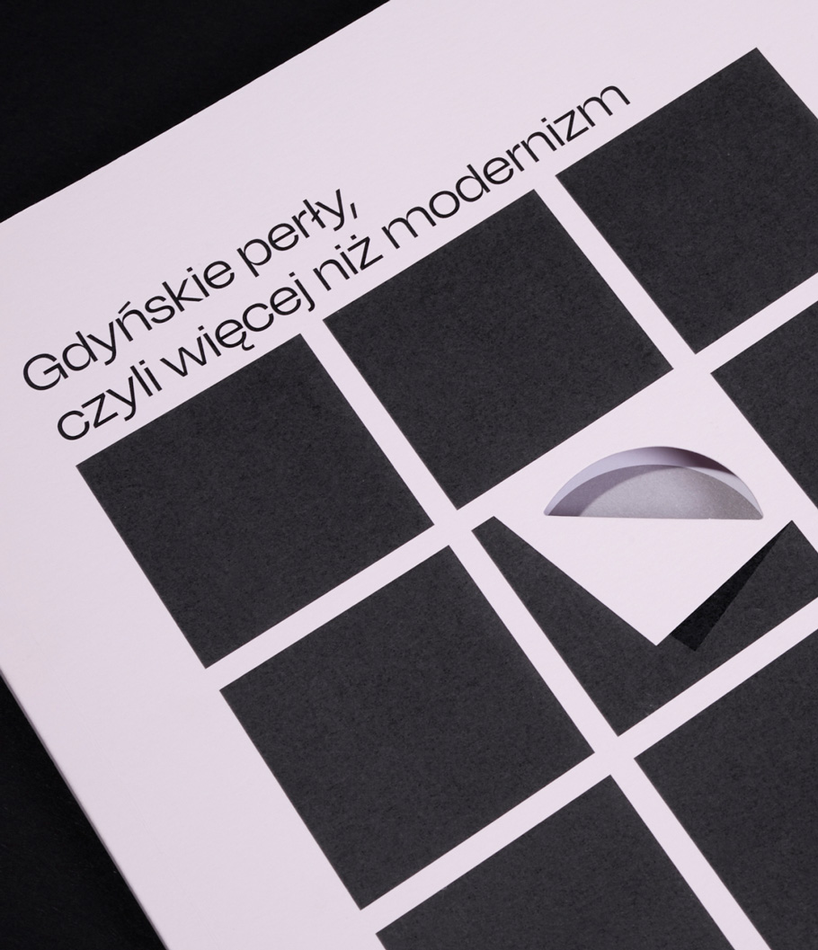
For the print, we used a unique metallic Pantone, lightly tinted with pink. Once again, we worked with Misiuro printing house, which made the difficult and long process of selecting the perfect shade extremely fun and creative.
